Final Designs
- Mar 1, 2016
- 1 min read
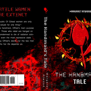
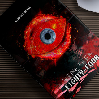
These are my final designs for my EPQ. I created realistic mockups for them and I also made a video showing them in a three-dimensional view. I used boxshot.com for this, which is a free online tool that allows you to view your dust jacket designs in 360 degrees.


FEEDBACK
1.)Messenger discussion with feedback participants


2.) I also did a posted a discussion/survey on Goodreads...

One person replied and his comments were very helpful. Again, he states that the design took away too much of the attention from the title and suggested ways I can counteract this like add a bar of line below the title to act as a solid text background or place it inside a rectangle.

2.2/3.)My survey results on SurveyMonkey with 11 participants. Some came from GoodReads whilst some are my peers or people from the Philippines whom I asked to take the survey.


To conclude, the reaction of my target audience to the dust jackets that I created was positive. However, the criticism that I received for them is that the title of the books needs to be more obvious and clearly seen because the other elements in the book, such as the logo and the images, overpowers it. Also, two people (one in my survey and one by talking to them) said that the designs look like they are targeted for people ages 12 years and up. It was kind of disheartening receiving negative feedback but I in order to improve I think that they are necessary. The most popular cover was the re-designed dust jacket for Fahrenheit 451 because of the logo that I created for it.
Comments