Observation: book shops
- Oct 8, 2015
- 1 min read
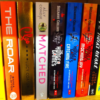
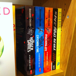
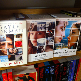
I decided to go to diffrent bookshops after seeing one of the replies in the discussion post that I posted on goodreads. I specifically looked the the spine of the books in the Young Adult section and compared them with one another. A lot of them had darks themes and a few were bright neon. I also looked at the bestselling books and see what their book spines look like.
I looked at the Young Adult (YA) fiction books of diffrent genres, focusing more on the YA dystopian books. The observation was very helpful as it allowed me to view the book jackets in real life and look at their designs in a three-dimensional way (i.e. the embossed sections, gloss, etc). It also gave me new ideas for designs like the types of fonts that I can use and the theme colours. For example, I noticed that most, if not all, of the YA dystopian books that I looked at had chunky title fonts to make them stand out and clear for the readers to see. The 'deteriorating' effect and textures are also very popular, which might be because it represents the image of a dystopian world.


Comments